Text Wraps in Safari, but Scrolls in Chrome
Problem
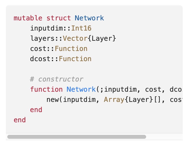
On your website, you want to display text (like code) that should not wrap to a new line if it exceeds its y-axis boundary. In other words, if a line of text is too long, you want the option to scroll, as in the screenshot below:

However, in several different contexts I’ve noticed that what works in Brave and Chrome doesn’t necessarily work in Safari.
Solution
I’ve recreated a minimum working example to emphasize this point.
Imagine you write the following HTML / CSS code:
<html>
<style>
code {
    width: 250px;
    background-color: lightgrey;
    display: block;
    overflow: auto;
    word-wrap: break-word;
}

.i-1 {
    padding: 0 1rem;
}
</style>

<body>
    <div class="code-block">
        <pre>
            <code>
                <span>def main():</span>
                <span class="i-1">my_really_long_var_name = [11, 32, 5, 53, 23, 67, 46, 7, 34, 2]</span>
            </code>
        </pre>
    </div>
</body>
</html>
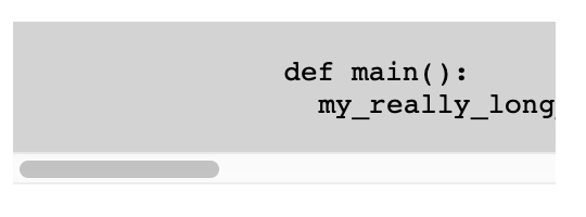
This will produce the following output in Brave browser (I assume it’s the same for Chrome).

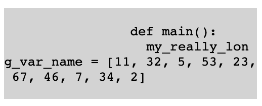
However, it will produce the following results in Safari:

Obviously, when there is such little code, it’s obvious that the issue is with the line word-wrap: break-word. In other words, if we change the style to
- word-wrap: break-word;
+ word-wrap: normal;
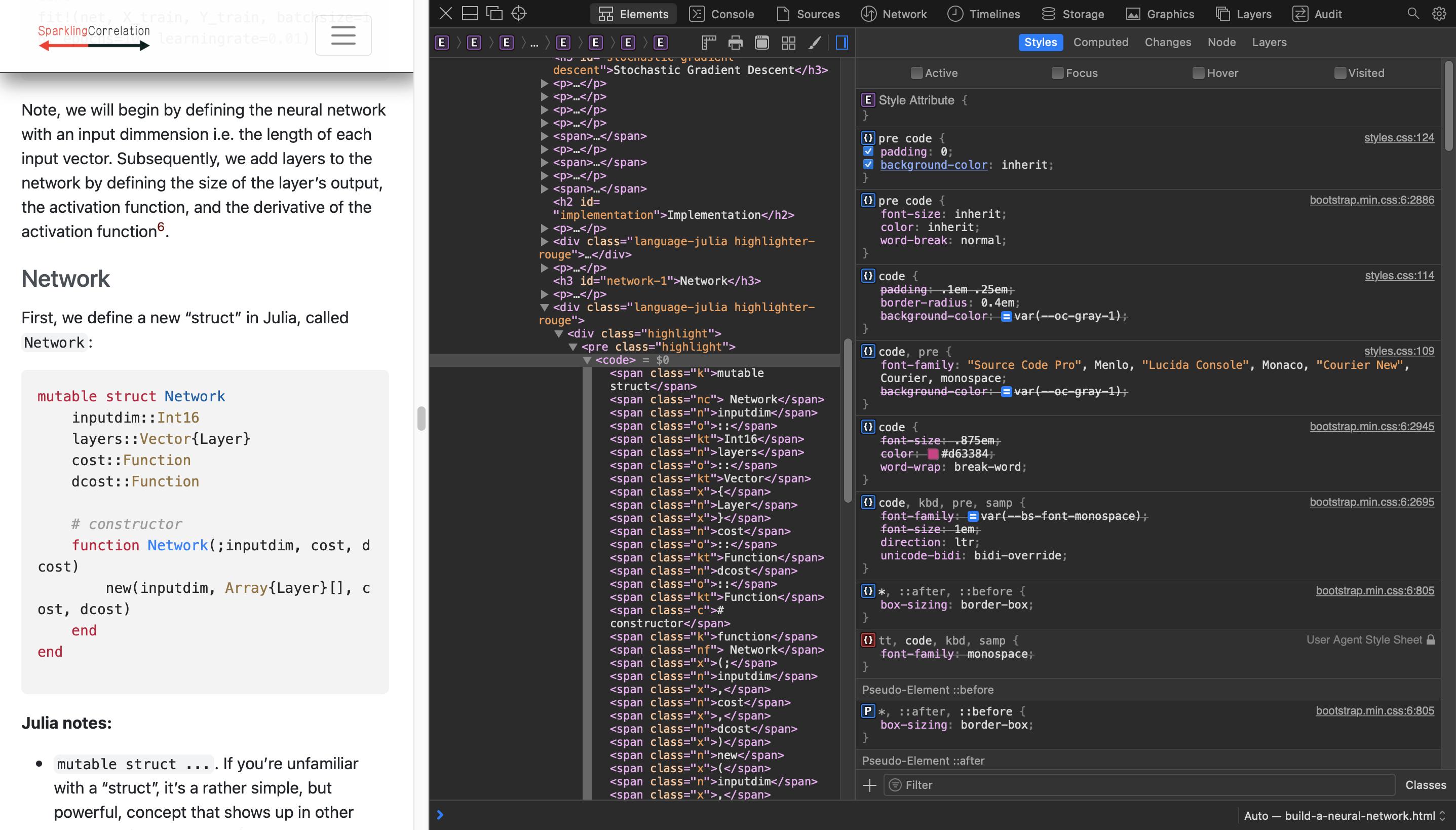
then it works in both browsers. But when it’s late, and you’re staring at this screen

let’s just say that things can take longer than you hope.
Summary
Safari and Brave / Chrome handle word-wrap: break-word differently when combined with overflow: auto. Brave and Chrome will still enforce the overflow: auto, while Safari will enforce the word-wrap: break-word. This can lead to confusion when using large and inherited style sheets.
If you want your overflow code to scroll and not wrap in Safari browser, make sure your final code block settings look like this:
code {
    width: 250px;
    background-color: lightgrey;
    display: block;
    overflow: auto;
    word-wrap: normal;

    /*
    ** TLDR: this works in brave, but not in safar
    **
    ** word-wrap: break-word;
    */
}